
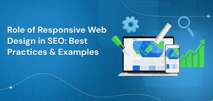
In today’s mobile-first world, having a website that looks good on every device isn’t just a design choice—it’s an SEO necessity. A responsive web design Company Noida ensures that your site automatically adapts to all screen sizes, offering a seamless experience for users whether they’re on a phone, tablet, or laptop. Beyond aesthetics, this directly impacts your search engine rankings, bounce rates, and overall visibility.
Let’s explore how responsive design boosts SEO and the best practices you should follow to stay ahead in search results.
Responsive Web Design (RWD) is a web development approach where the layout and elements of a website adjust automatically according to the screen size and device. Instead of creating separate desktop and mobile versions, one flexible layout fits all.
Key features of responsive design include:
This ensures users have a consistent and smooth experience, which Google rewards with better rankings.
1. Google’s Mobile-First Indexing
Google primarily indexes the mobile version of websites. If your site isn’t optimized for mobile, your rankings can drop significantly. Responsive design ensures your website meets Google’s mobile-first indexing criteria effortlessly.
2. Improved User Experience (UX)
Search engines prioritize websites that users find easy to navigate. A responsive site loads fast, has clear navigation, and doesn’t require pinching or zooming—keeping visitors engaged longer.
3. Lower Bounce Rate
When users leave quickly due to poor mobile display, search engines view it as a signal of bad experience. A responsive layout minimizes bounce rates and boosts user engagement metrics, which supports SEO performance.
4. Faster Page Loading Speed
Speed is a major ranking factor. Responsive websites typically load faster because they use optimized coding and adaptive images. Fast pages improve both SEO rankings and conversion rates.
5. Single URL for All Devices
Having one URL structure makes it easier for Google to crawl, index, and organize your site content. It also reduces duplicate content issues that arise from separate mobile and desktop versions.
SEO Best Practices for Responsive Web Design
1. Use Mobile-Friendly Layouts
Ensure clickable elements (buttons, links, forms) are well-spaced and easily accessible on touchscreens. Avoid cluttered designs that frustrate users on smaller screens.
2. Optimize Images and Videos
Use responsive images (srcset attribute) and compress media files to maintain quality without slowing down your site.
3. Prioritize Page Speed
Leverage caching, minimize redirects, and use modern image formats (like WebP). Tools like Google PageSpeed Insights can help identify speed issues.
4. Test Your Site on Multiple Devices
Use Google’s Mobile-Friendly Test to check how your site performs on different screens. Fix any rendering issues or text overlap problems immediately.
5. Avoid Intrusive Pop-Ups
Pop-ups or interstitials can hurt mobile usability and SEO. If necessary, ensure they’re small, dismissible, and don’t block essential content.
6. Keep Navigation Simple
Use a hamburger menu or sticky header to make navigation intuitive. A clean layout improves user interaction and dwell time.
7. Structured Data & Metadata Optimization
Make sure your structured data, meta tags, and titles are the same across all device versions. This ensures consistent crawling and ranking.
Benefits of Responsive Web Design for Businesses
Final Thoughts
A responsive web design is more than just a trend—it’s a vital component of modern SEO strategy. It aligns user experience with technical optimization, helping your website perform better in search results and build stronger online credibility.
If you want your business to stand out and rank higher on Google, start by making your website fully responsive today.
Ready to optimize your website for SEO and responsiveness?
Get in touch with our web design and SEO experts to transform your online presence into a powerful growth engine.
 Best SEO Company in Noida for Business Growth & Higher Google Rankings
 Best Digital Marketing Agency for Doctors to Grow Your Clinic & Increase Patient Leads
 Arissoft Technologies Digital Marketing Services for Doctors to Boost Online Presence & Patient Trust
 Arissoft Technologies – Best SEO Agency in Noida Delivering Result-Driven Digital Marketing Solutions
 Why Your Website Remains the Most Powerful Tool for Lead Generation
 Best Website Development Agency in Noida for Modern & High-Performing Websites
.jpg)